Question 2
How effective is the combination of your main product and ancillary texts?
For our brand, it is essential that there is an image that will be easily recognised because it helps our product stand out from other competitors in the film industries. The stronger the brand, the more popular the iconic image will be which will increase more viewers. When relating to horror, it can consist of different brands such as persona, props, setting, logo and even font style.
Fonts
|
Fonts can be used to recognise a film brand. We have used this for our poster and magazine because we want our audiences to recognise our film brand.
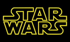
Star Wars is an example. It was first aired in the 70s and has been using the same font through all of its movies made by George Lucas. Because of the title, fans and other audiences pay more attention to the title than any of the main props or persona. |
|
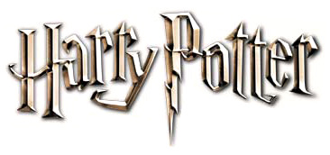
Harry potter is another famous franchise made in Britain. This is another example where the font also represents the main brand of the film. Unlike Star Wars, The font uses the main protagonist full name. This may be because they want its audience to recognise the main protagonist instead of the other characters and they also made the letter 'P' like a lightning because Harry has a lightning scar on his forehead.
|
|
Images
|
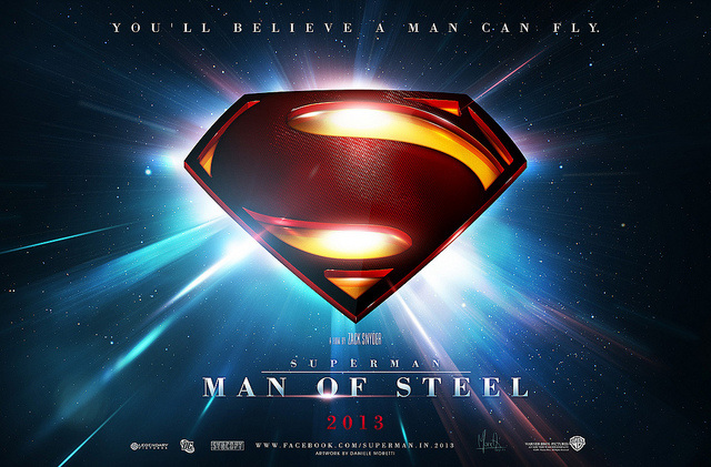
SuperMan Man Of Steel is an example of a brand which is mostly recognised by its logo than its font or title. For our poster and magazine, we have not used any logos and we mostly focused on the character image and font title. Superman was first created the early 20th century in comics and over the years it has been on television series and films. The logo has always been on every posters and magazine covers that is about superman.
|
|
Nightmare on elm street is another example where a lot of people would recognise more on the character/image more than the title font. This picture is the infamous antagonist called Freddy who is easy to recognise because of his horrible skin and sharp blades for claws. This is also effective because the background fades to darkness outwards and his face is hard to look at which gives an eerie but curious feeling. Also because he appears in people's dreams, the background gives a feeling that he will appear out of no where and hunt the victims.
|

|
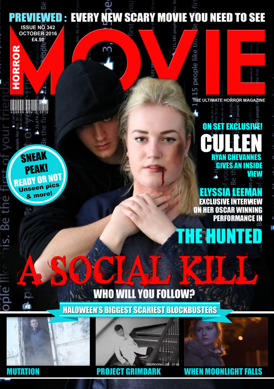
Final Magazine
|
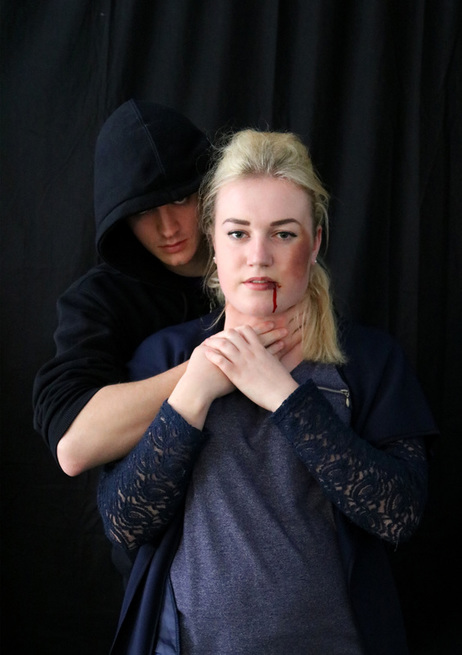
Original photo
|
For our original magazine, we have used some blood which is edible in case if she swallows it and use red colouring to make it look similar to blood. We have also used some eye shadow and dark blush so that it would look like she has a big bruise on her cheek. We also use the villain standing behind and strangling the victim to show how dangerous he is in our film. For our final magazine we have still kept the background black so that Charlotte sticks out while most of James blends in with the background to give it an eerie feeling. Although we have use likes in the background to give it a social network feeling. We have made our magazine called 'Horror MOVIE' where we could show our cover to use.
|
|
|
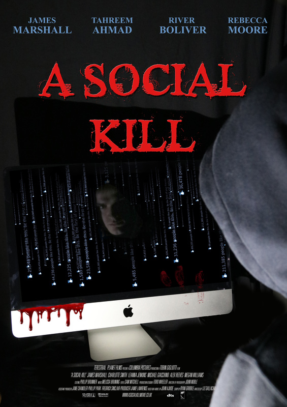
Final Poster
|
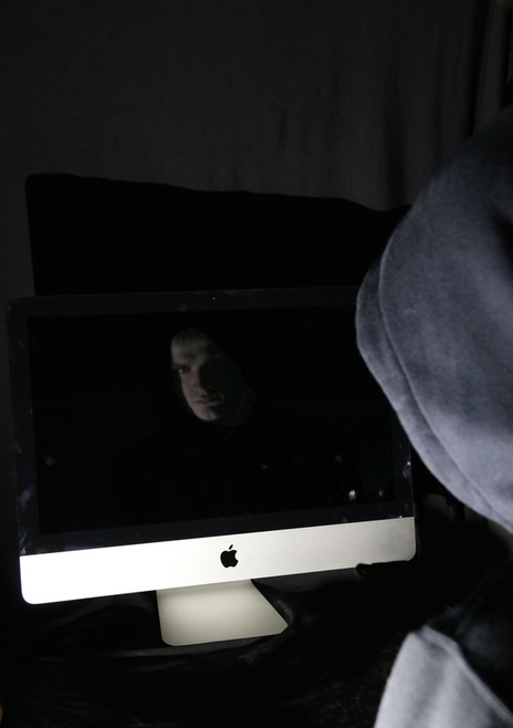
Original Photo
|
Four our poster we have used the media room so we could use a dark room with a computer on its own. even though we turned the lights off, we have also used a dark cover behind the computer to give the room an eerie feeling and to cover anything that was on the wall. We used a torch which faced the computer and villain. This is because we want viewers to clearly see the computer, the villain and the villain's face reflect on the computer screen. For the final poster, we have added some blood on the screen to show there will be violence and maybe gore in the film.We have also added the title in bright red just above the computer to show there will be violence, blood and death. We have also put the creators at the top so that our viewers can see who created the film.
Products